Clarity isn’t about showing less—it’s about showing what matters most. A transit concept designed around timely information, confident decisions, and reduced cognitive load.
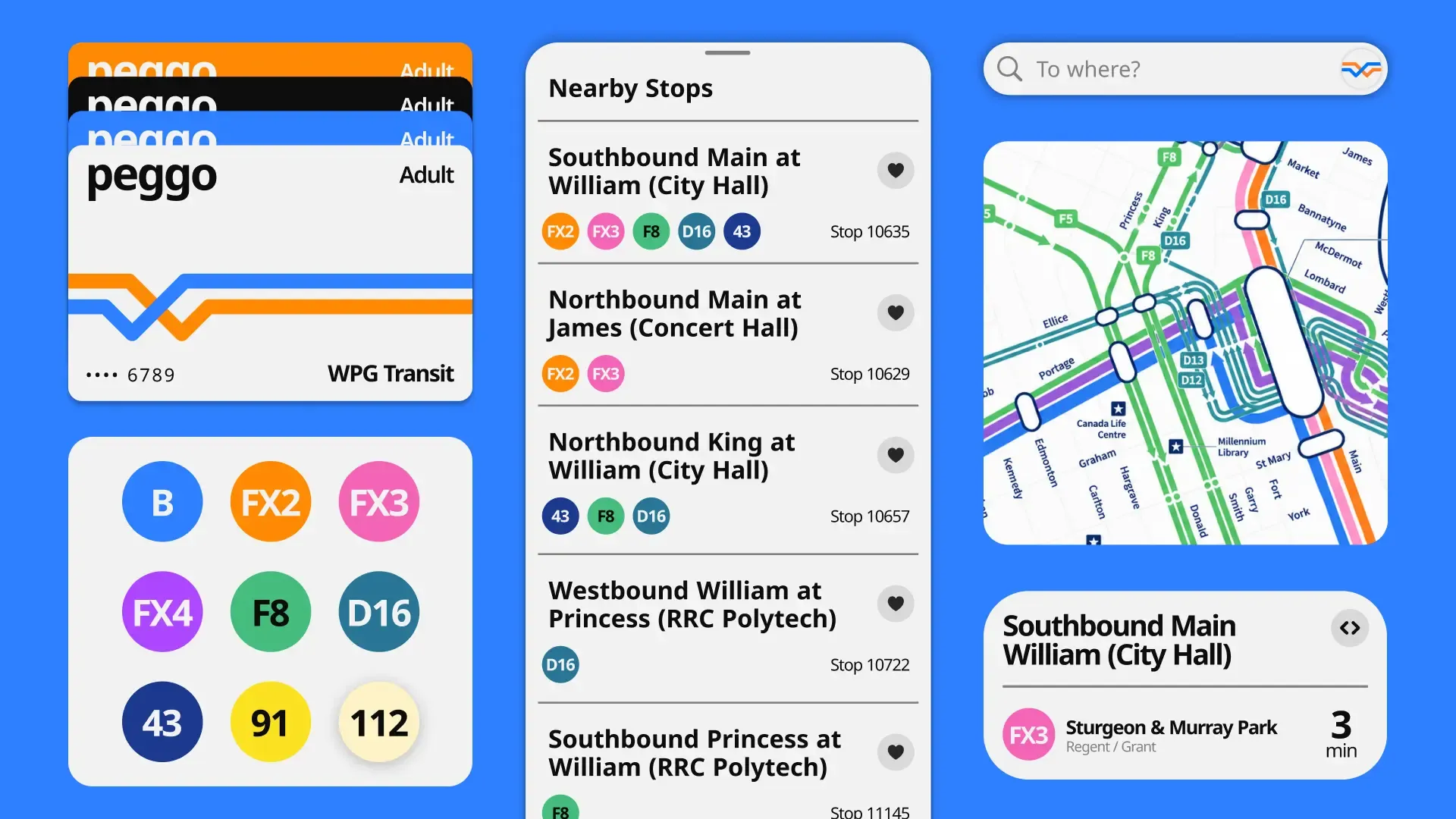
Transit information is only useful if it can be understood quickly. Yet many transit apps overwhelm riders with maps, alerts, schedules, and competing interface elements, turning simple questions into moments of uncertainty.
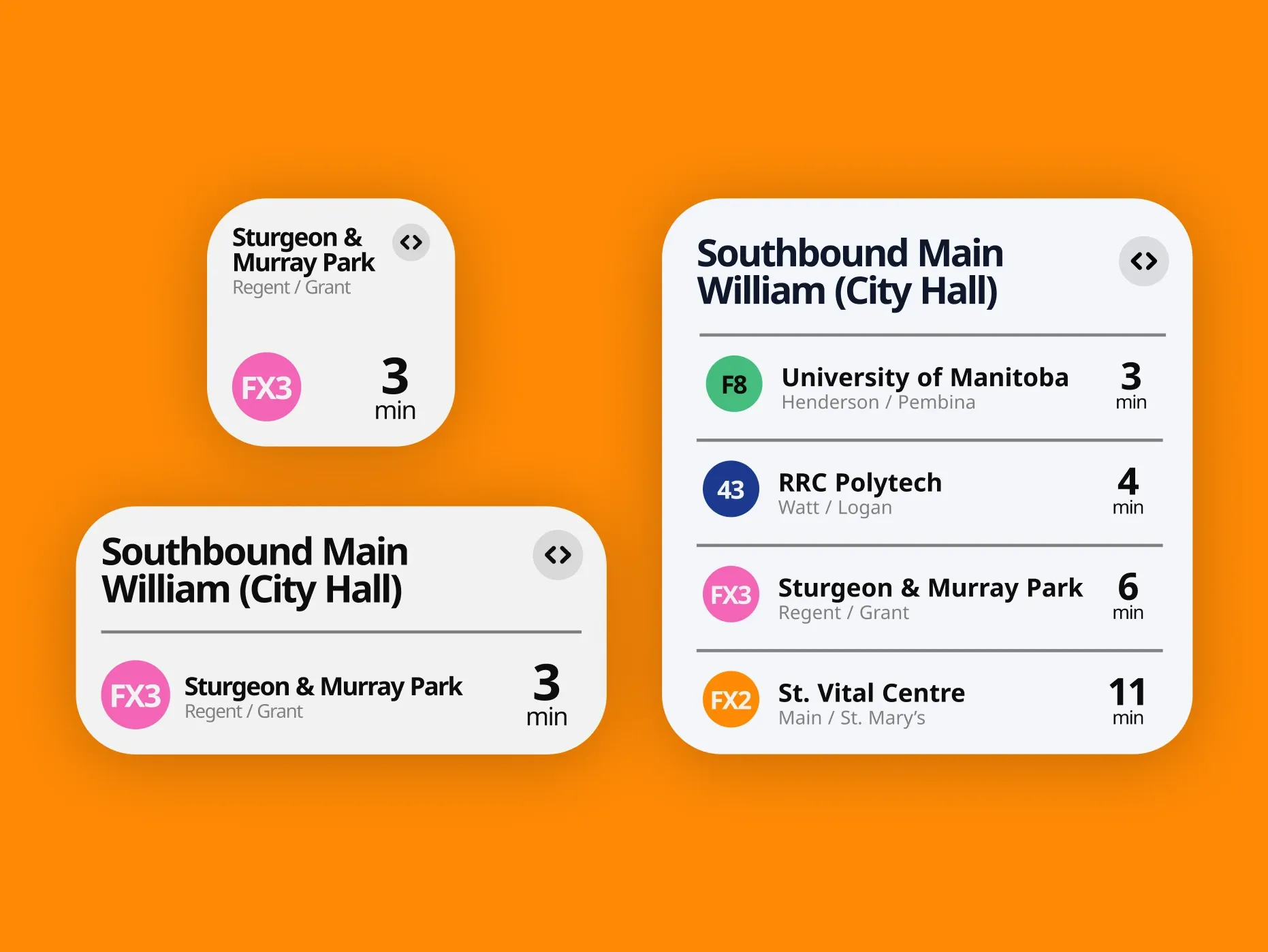
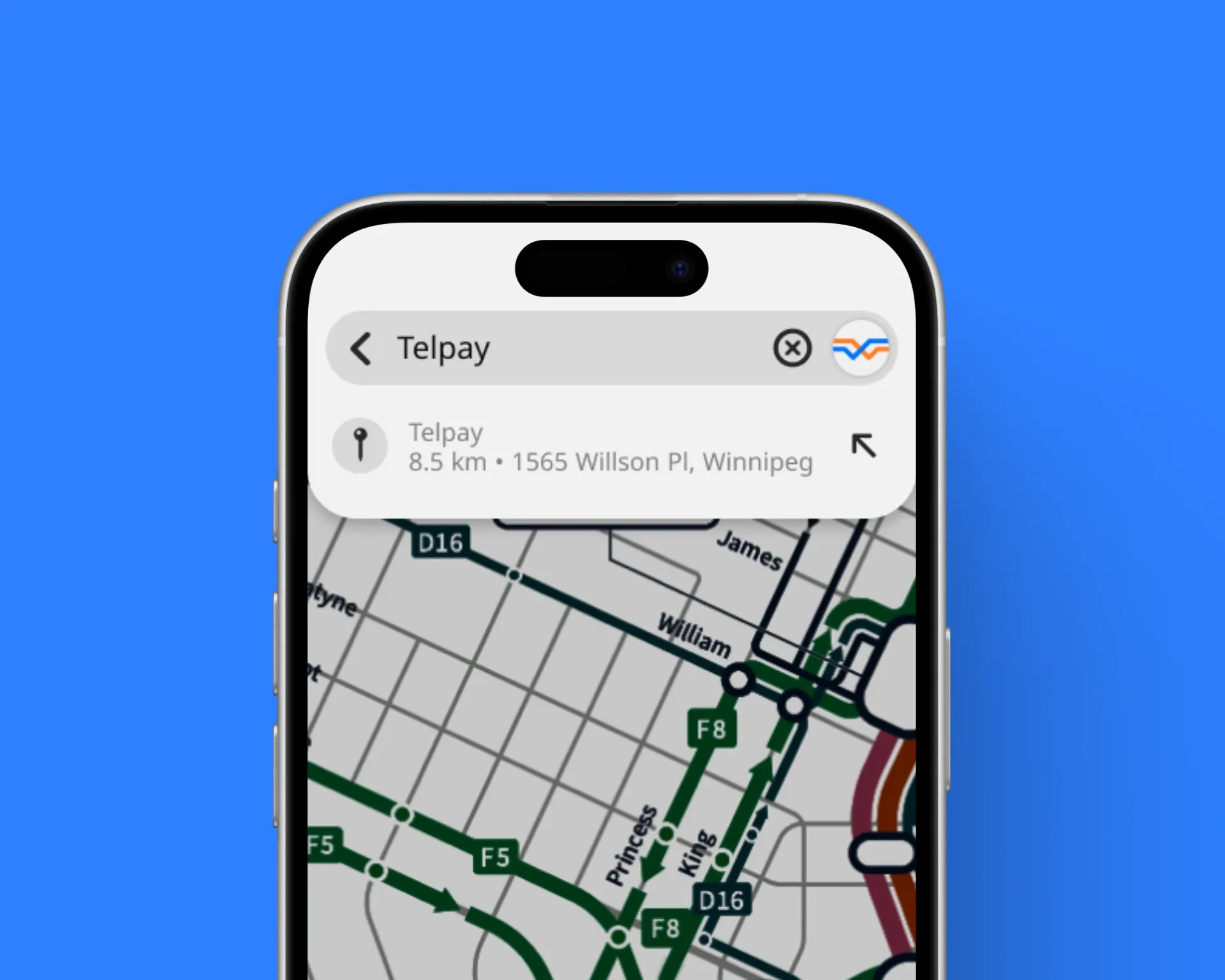
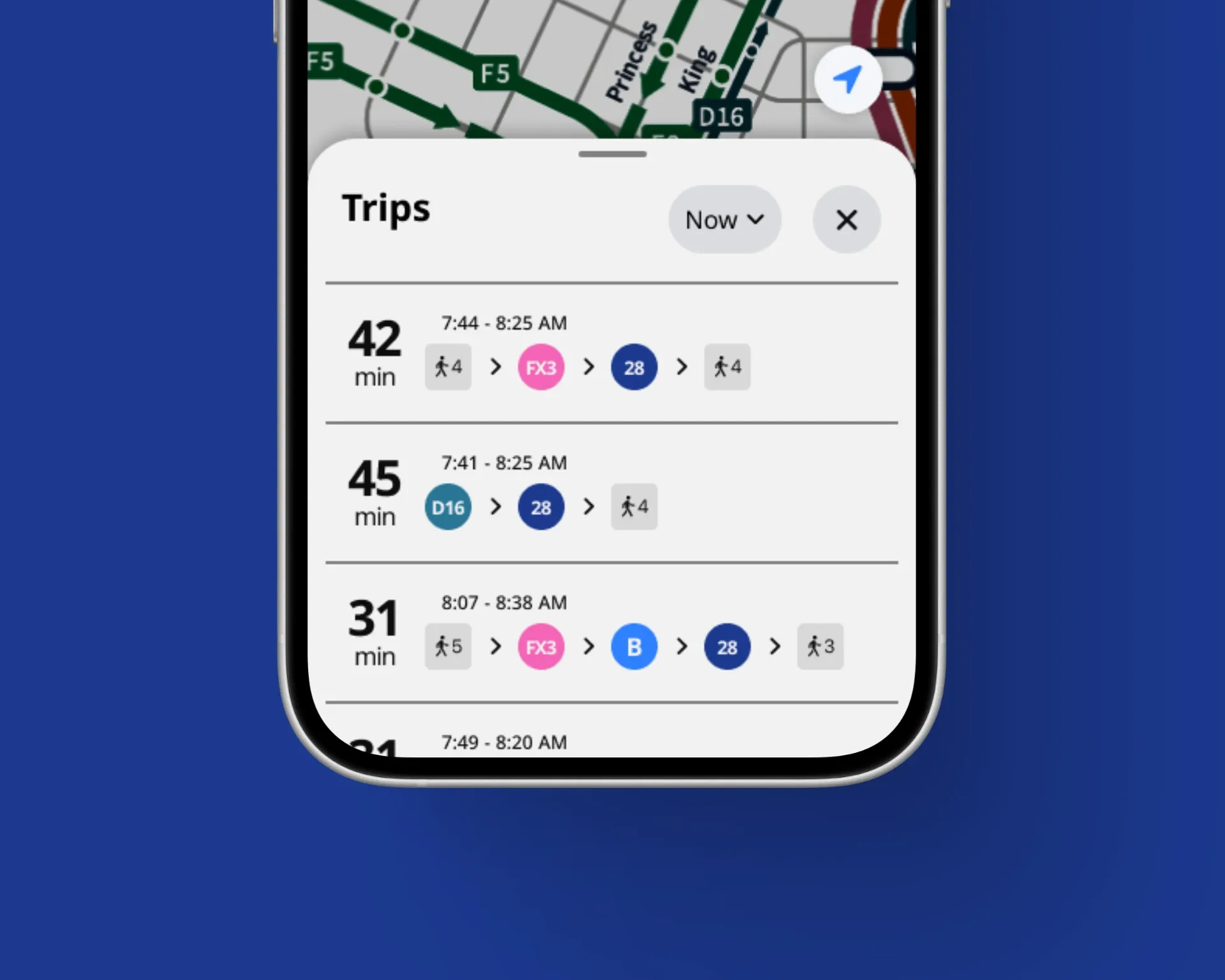
WPG Transit explores a different approach—one that prioritizes time over geography. Rather than presenting every available piece of information, the experience focuses on surfacing what matters most in the moment: when to leave, when to board, and whether service changes meaningfully affect the journey ahead.
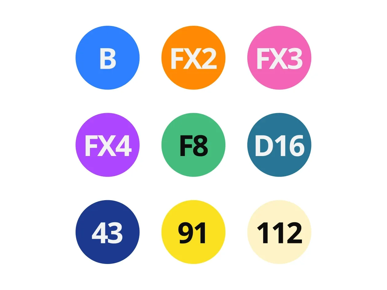
Through strong typographic hierarchy, time-focused route cards, and a restrained visual system, the concept reduces cognitive load without sacrificing information. The result is a transit experience built around confidence rather than complexity, helping riders spend less time interpreting information and more time moving through the city.